BMO Global Asset Management Investment Dashboard
BMO Global Asset Management
CLIENT:
UX/UI Designer
Visual Designer
ROLES:
12 Months
PROJECT DURATION:
Overview
BMO Global Asset Management is a worldwide investment manager with offices in more than 25 cities in 14 countries worldwide. BMO Global Asset Management (BMO GAM) is the asset management arm of the Bank of Montreal (BMO) – one of Canada's largest banks.
Problem
Investors had to log on to three different tools to access information on their investment portfolio and fund factsheets. The head of client management wanted a new streamlined digital solution in the form of an investment dashboard, that was accessible to investors, as well as the wealth management personnel they may work with.
Solution
I designed a new responsive client investment dashboard that featured high-level breakdowns of investor’s financial information in a simple but intuitive layout. I worked in a project team with an investment writer, project manager, portfolio manager, data lead and developers. I carried the project through from planning, research, wireframing and prototyping.
I used the Design Thinking Process and various ux research methods during this project. This was an iterative rather than sequential process.
Empathise
Business goals
User surveys
User interviews
Competitor analysis
Define
Empathy mapping
Feature priority matrix
Personas
User journey
Ideate
Brainstorming
Sketches
Prototype
Low-fidelity wireframes
High-fidelity prototype
Testing
Usability testing
Results
Next steps
Empathise
I established the business goals and stakeholder requirements of the project.
As the only designer on the project, I obtained a more in-depth understanding of the business requirements by conducting and facilitating a workshop with key business stakeholders.
Key business goals and requirements discovered from the session are:
Needs to allow users to track and manage their investments
Understand what additional features users would like from the solution
Display personalised information relevant to the investor
Have the ability to update investors on the latest industry news and insights
Offer security and reassurance and be straightforward to use
Needs a intuitive layout and the dashboard needs to incorporate a chart
Needs a clear navigation system with a simple menu to help users easily find what they are looking for
To gain insights from a diverse range of users, we sent out a survey to investors on our mailing list.
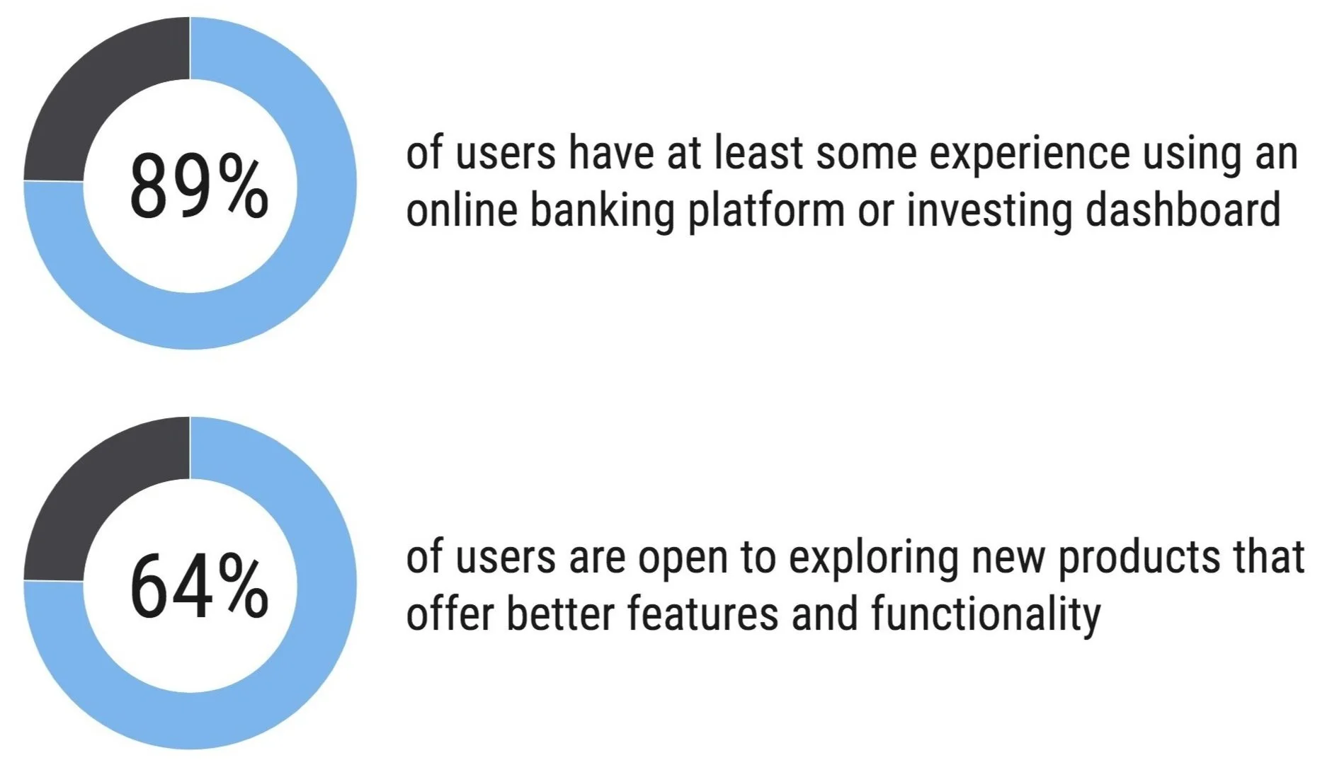
I created a survey which was sent out to 200+ investors by email via the marketing team, to uncover invaluable feedback on user behaviours, needs and experience using financial tools. Below are some of the key insights I discovered.
Key takeaways from user surveys:
I carried out user interviews to obtain qualitative data on investor’s experiences using digital investment services.
Through in-depth phone interviews with 5 investors lasting approximately 30 minutes, I uncovered insightful feedback about their investment experiences and their own habits, goals and needs. Here are some of the thoughts and views that I discovered.
Snippets of replies from investors who participated in the user interviews:
Key takeaways from user interviews:
Most users have a goal of managing their investments efficiently and achieving the best returns possible
They also want to be able to easily track their investments and monitor their performance with minimal effort
Users prefer a simpler user interface that focuses on providing only essential information quickly and easily
Navigation is important to users because they need to be able to easily access the information they need and compare different investments
Portfolio returns and overall value should be presented in the context of long-term investments and be easily understood
I carried out a competitor analysis of other financial dashboards to identify trends, strengths and weaknesses.
By leveraging this approach, I was able to gain insight into the competitive landscape and pinpoint exactly how competitors were elevating their user experience. Examining features closely allowed me to identify patterns that could be integrated seamlessly into my dashboard design.
Define
I created an empathy map to create a shared understanding of user needs and aid decision making.
To get an even clearer idea of the wants and needs of users, I developed an empathy map that encapsulated all of my research findings into a fictional representation of my core user who I named Tony.
I devised a feature priority matrix to balance user value and business effort.
The feature priority matrix helped identify the most important features to include in the dashboard. This structured and objective approach helped achieve collaborative consensus within the project team, whilst satisfying the varied needs of the user and business.
I created three user personas to create understanding and empathy with the end users.
After synthesising the data, I created three investor personas. Each persona varied in investor type, needs and incomes.
I mapped the user journey to further understand the user’s interactions and to identify any development opportunities.
To gain a better understanding of how users would interact with the dashboard, I created a user journey map to provide a visual representation of the entire customer experience. This allowed me to identify any potential issues and improvements that could enhance the user’s overall satisfaction.
Ideate
I started sketching potential layouts for the dashboard.
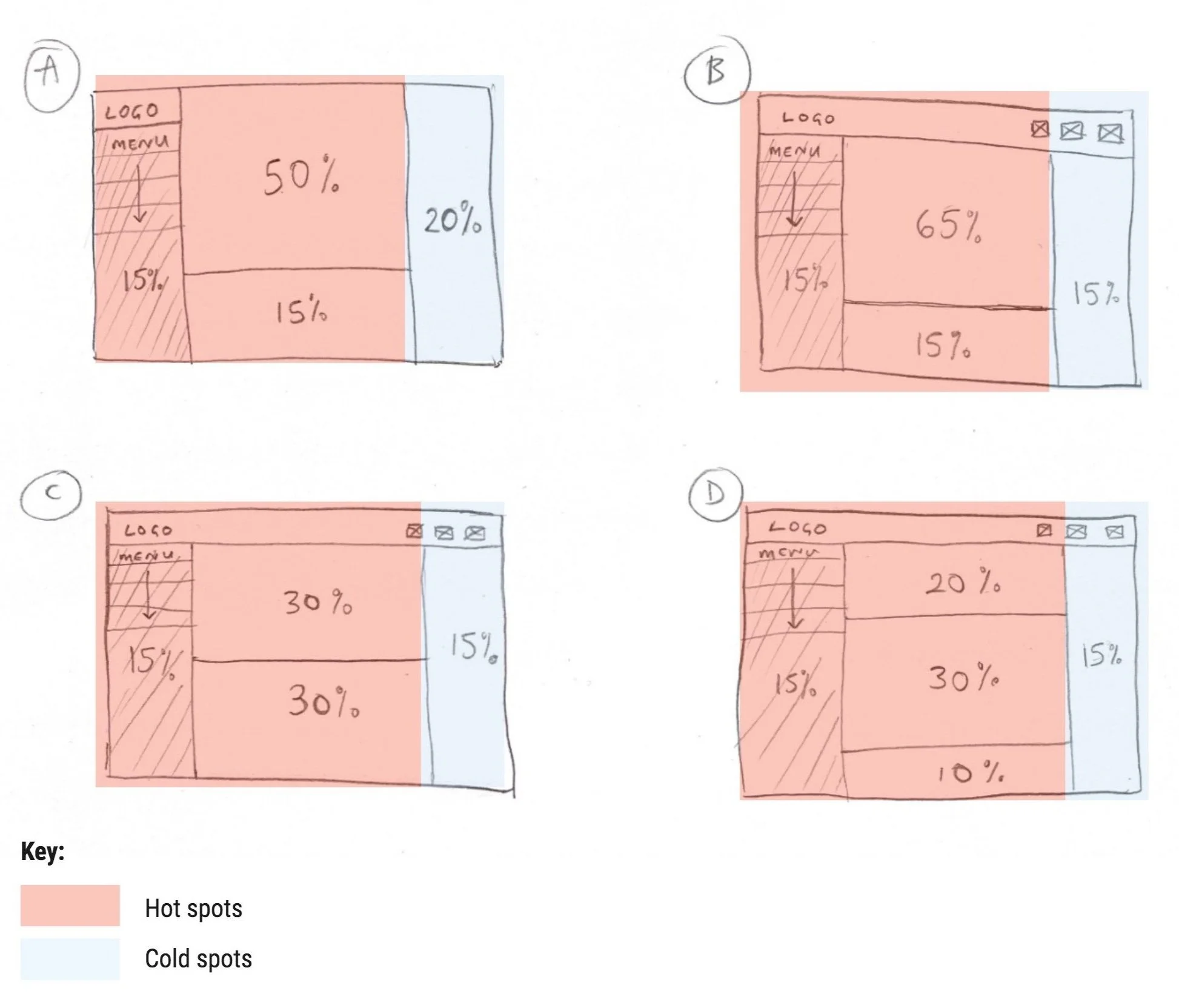
As web users spend 80% of their time viewing the left half of the page and 20% viewing the right half (Nielsen Norman Group, 2017 eye tracking study), I wanted to reserve the left side of the screen for primary information, such as main portfolio value and performance; and the right side for secondary information. This could help users understand the hierarchy of the page and easily scan for key information.
After generating a few ideas, I also analysed the layout using heatmap methodology. I presented the ideas back to key stakeholders to vote on which layout was the strongest concept from the below – which was sketch C.
Prototype
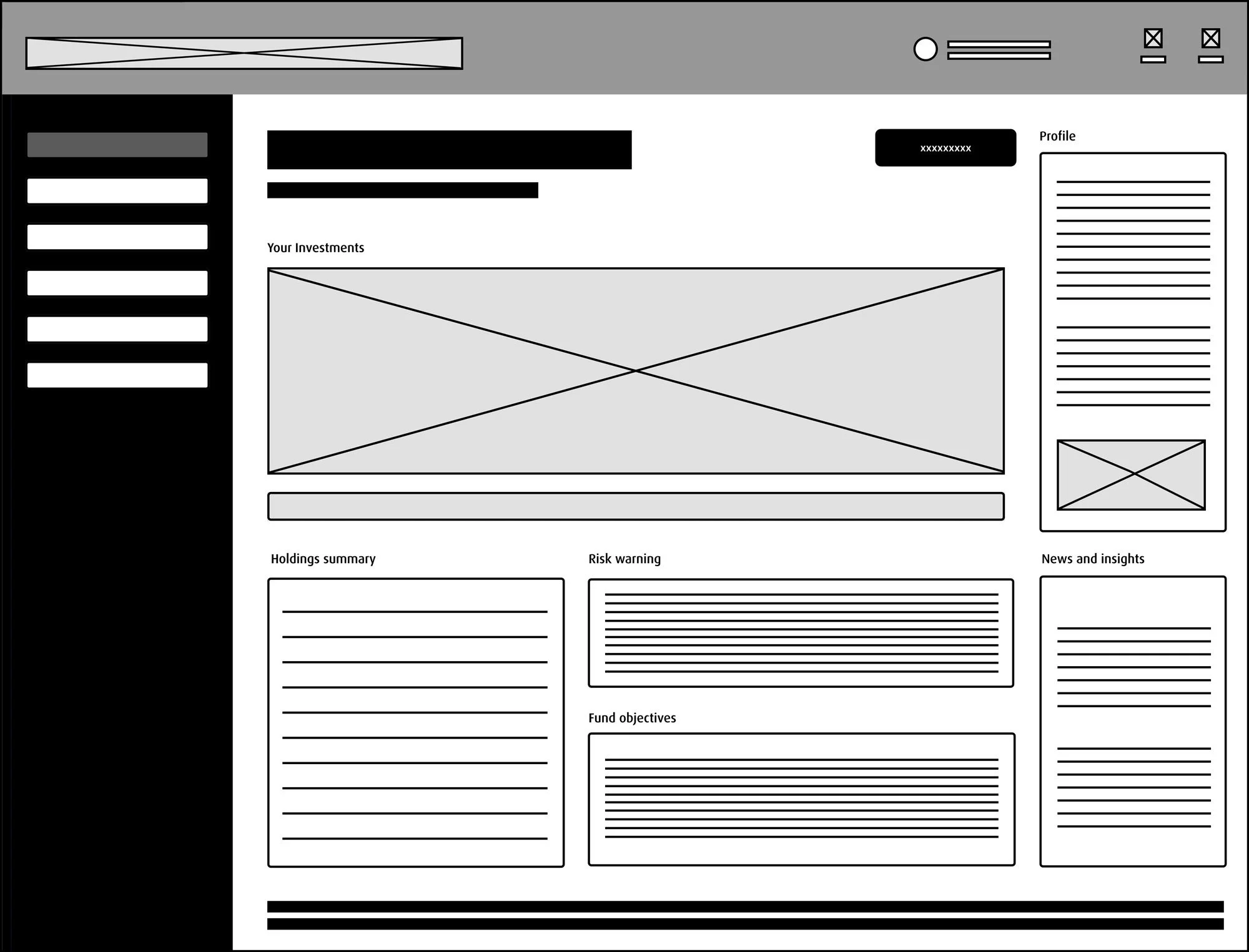
I took the strongest concept of sketch C and created wireframes to develop my idea further with more detail. Below are the wireframes I created.
I created low-fidelity wireframes to develop my sketches further and use for the first phase of usability testing.
Above: Desktop dashboard wireframe
Above: Mobile dashboard wireframe
Testing
I carried out usability testing to ensure the dashboard's functions, features and overall purpose were in line with what users wanted.
I used the low fidelity wireframes for testing with my users and key stakeholders. This process gave me a better understanding of the user’s interaction with the dashboard. I also gained valuable feedback and devised a set of changes to implement prior to creating the high fidelity design. I synthesised all the feedback and insights into a list of design changes. Below are the top four testing issues identified by the group of users and stakeholders. As a result, I did a second iteration to better suit end-users’ and stakeholder needs with the adjustments above.
Change 1: Moving logo to far left of header on mobile version
Change 2: Adding ‘add to watchlist’ feature to companies on desktop version
Change 3: Adding shortcut navigation icons to top right header on desktop version
Change 4: Adding ‘favourites’ feature to articles in news and insights
The final product
I worked closely with the web developers to finalise the design of the dashboard. After development was complete and the dashboard was built, it was launched to coincide with a marketing campaign to promote it.
High-fidelity prototype of responsive dashboard
Key features of the dashboard
High-fidelity interface of responsive desktop and mobile webpage
Results
Launched dashboard
546 new accounts created in second month post-launch, an increase of +15% MoM
Satisfaction survey received excellent feedback – CSAT score 80%
Next steps
The next phase of this project will be for senior stakeholders to assess the demand and budget constraints of adding new features to the dashboard from the feature prioritisation matrix


